How to Create a Stunning Logo for Your Business
Everyone needs a visual representation of their brand or business. That is why logos are such a big deal—they become the symbol by which others imagine your business.
We’ve compiled an ‘all you ever need to know about designing your own logo’. Ready? Here are the steps you need to take in order to design a logo that truly represents your brand.
1. Choose the right logo design software
We know that your time is limited. You may be surprised to learn that creating a logo by yourself is much easier than you thought. There are many online options to create a good logo for your business like: Logo Maker or Canva. In record time, you can personalize and download a logo that shows your brand and you can immediately use it (website, social media, business cards, etc.).
2. Understand what makes a good logo
Now that you have chosen a platform, it is important to understand what a logo should contain. There are some key principles you should consider. According to the definition, it should be:
▶Simplicity: The phrase “less is more” is worth it. As simple as your logo, the easier it is to remember.
▶Visibility: You want a logo that looks good, no matter where it is located. If it appears only on large screens, but it is impossible to read on a small piece of printed paper, think again.
▶Determination: Your goal should be to design a logo as if it were the last one. Always ask yourself, “Will it still look good in 10 years?” Before you make your logo.
3. Stay loyal to your brand
In some cases, your customers can identify your logo faster than your business name! Two aspects (essential):
•First: Always take the time you need to understand your brand identity and visual language (colors, fonts, atmosphere, etc.)
•Second: Good brand requires consistency. The logo you design should be found on the web (web, social media, email, etc.) as well as offline (brochures, business cards, articles in magazines, etc). Seeing the same logo in many places will help your customers become familiar with it.
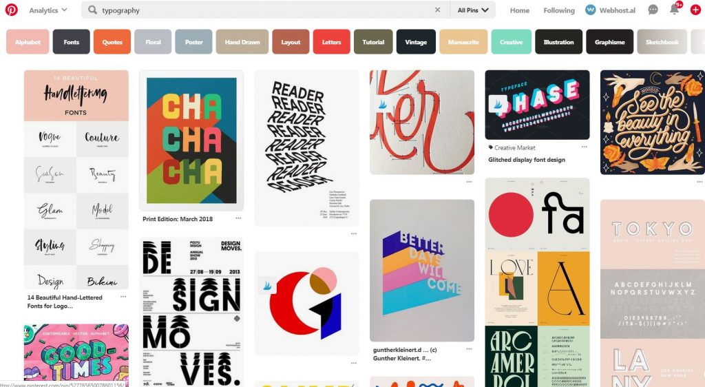
4. Find the right inspiration
Look at the latest logos trends. Trends include creative typography and the use of bright and daring colors.
People form opinions about a brand, product, or service within the first ninety seconds of exposure. Around 90% of that initial product assessment is related to color.
Do not limit your exploration to just the ideas associated with the logo.In Pinterest, there are many new creative palettes, typography and designs.
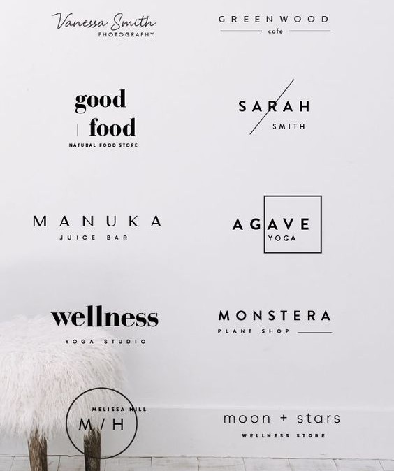
5. Find the right type of logo
There are two main categories of logos. The first is known as iconic (or symbolic)They are iconographic images that are easily recognizable and represent your brand with an image. You can choose something simplistic or more complex, but make sure to pick a symbol that creates a unique connection to your brand. Because it does not show the name of the brand, it is mostly used by a limited number of large companies, which already have a strong history and identity. As a small or medium business, it is highly recommended to go for the second category: the logotype. Very straightforward way of using you company name as a logo.
Want more text? At the top of your brand name, you can add a slogan. Usually comes in the form of a short and attentive sentence that describes a behavior, product or feeling. A famous example we all know is from McDonald’s: “I’m lovin ‘it”. Go for this option if you really give more information or offer a deeper understanding of your brand.
Pick the right typography
6. Select the appropriate fonts
There are many things to consider when it comes to choosing the right fonts for your logo. Keep it simple.
When it comes down to how many fonts to use, we recommend a font for your brand name and another font for the sentence (if you decide to add one). The most important thing is that both fonts live in harmony within your logos.
7. Choose your graphic
A graph is worth a thousand words. It is actually the central element of the logo. If you have a product, use the object as the icon. If your business is more abstract or does not come with a particular product you can use geometric shapes and lines to create a visually appealing graphic. Fortunately for you, there are thousands of engaging icons available for free at Logo Maker. Once you’ve found the right icon, play with the size. Find the right balance between all the different elements of your logo so that you can finally have a harmonious result.
8. Pay attention to color
Colors can have a ton of different meanings. The use of color within a logo is a carefully thought-through process. Why? Because believe it or not, colors have the ability to affect and evoke specific emotions within people.
Of course you don’t need to stick with just one color, but you can combine several colors to tell a complete brand color story.